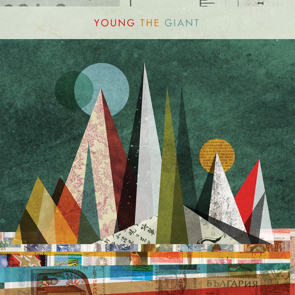
•Bright colours and shapes reinforce the indie genre and the type of indie rock that the music will be.
•The shapes are made up of cut up paper which gives of a vintage feel.
•The shapes also seem to create a cityscape or mountains.
•The font colours relate to the colours used in the rest of the CD cover.
•Different languages are used in the cut up pieces of paper, which makes the cover seem more exotic.
•The colours make the cover very eye-catching, and would be noticed in a store or online.
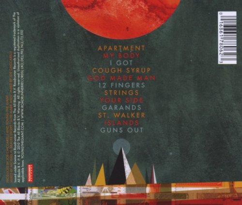
•The back of the CD carries on with the same design style and colour selection.
•The barcode is the only thing that breaks the colour scheme.
• Information about the band and the record label is situated on the left of the design.
•The song names are in the same colour as the band name in the front cover, this makes the design of the CD flow effortlessly.
•The songs are centred in a small font to enhance the minimalism in this design, which relates to the front cover.
No comments:
Post a Comment